View on App Store
4.8
1.7M ratingsScreenshot story
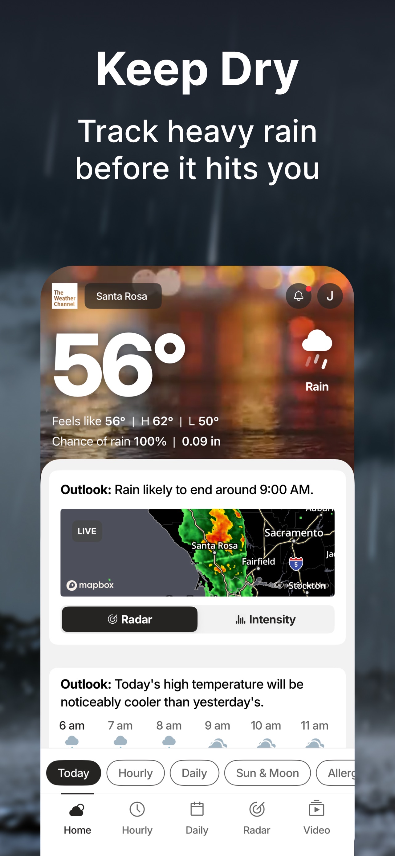
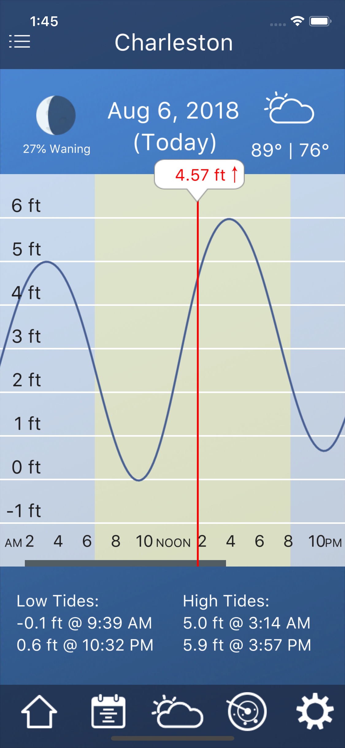
The sequence moves from a global overview of multiple cities to a granular, hourly forecast for a specific location, concluding with high-resolution data visualization via an interactive precipitation map.
iPhone gallery
The complete screenshot set
Select any frame to study its layout, content, and palette.
Observed in the listing
Frame-by-frame listing evidence
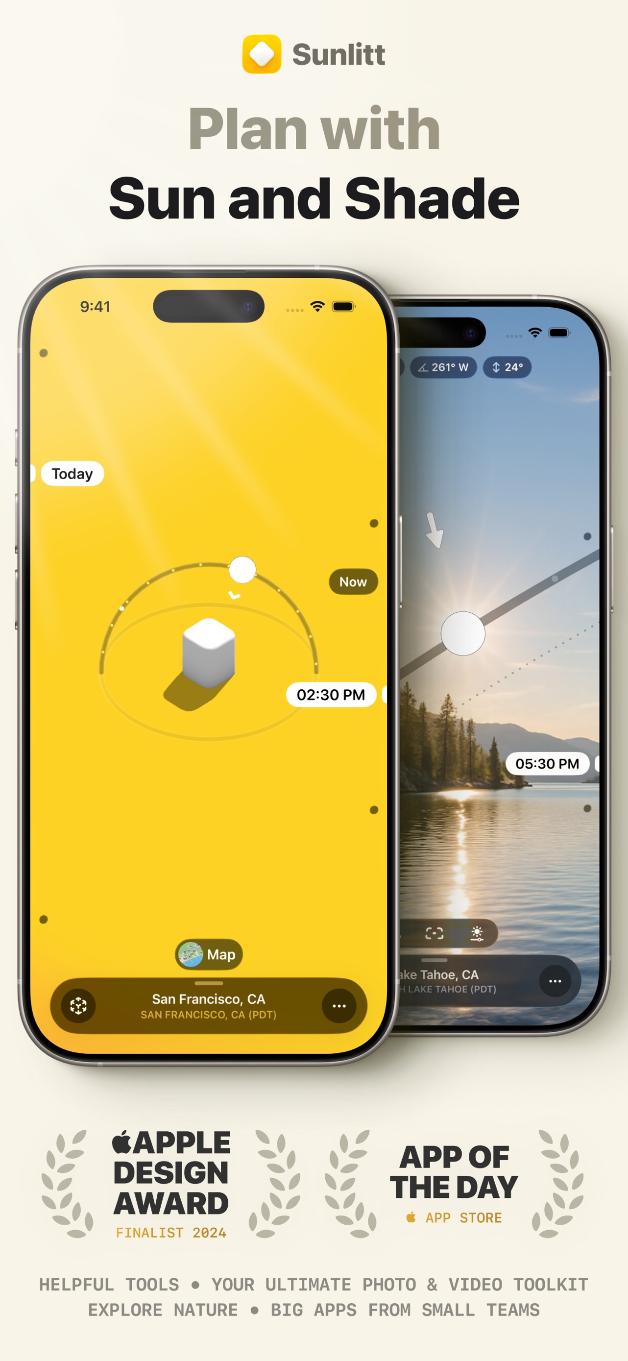
Across 3 frames, Weather most often uses floating device composition and device treatment with solid backgrounds. 0 frames include visible caption copy.
Frame 1
ui screenshot presentation
- Composition / device
- floating device
- Content
- ui screenshot
- Background
- solid
- Copy treatment
- none, neutral
Frame 2
ui screenshot presentation
- Composition / device
- floating device
- Content
- ui screenshot
- Background
- solid
- Copy treatment
- none, neutral
Frame 3
ui screenshot presentation
- Composition / device
- floating device
- Content
- ui screenshot
- Background
- solid
- Copy treatment
- none, neutral
Explore by detail
Study the system behind the set
Design analysis
What makes this set work
Apple's design strategy for the Weather app utilizes a 'show, don't tell' philosophy by completely omitting marketing captions. By presenting raw UI screenshots within clean floating device frames, the design relies on the app's visual richness-such as the atmospheric background gradients and intricate weather animations-to demonstrate value. The layout choices emphasize density and data hierarchy, moving from summary cards to detailed lists and finally a full-screen map. Designers should note how the color system isn't static; it shifts dynamically based on the weather conditions shown, making the screenshots feel alive. This approach signals a premium, utility-first brand identity that trusts the product's interface to communicate its features without auxiliary sales copy.
Keep exploring