
View on App Store
4.8
110.7K ratingsScreenshot story
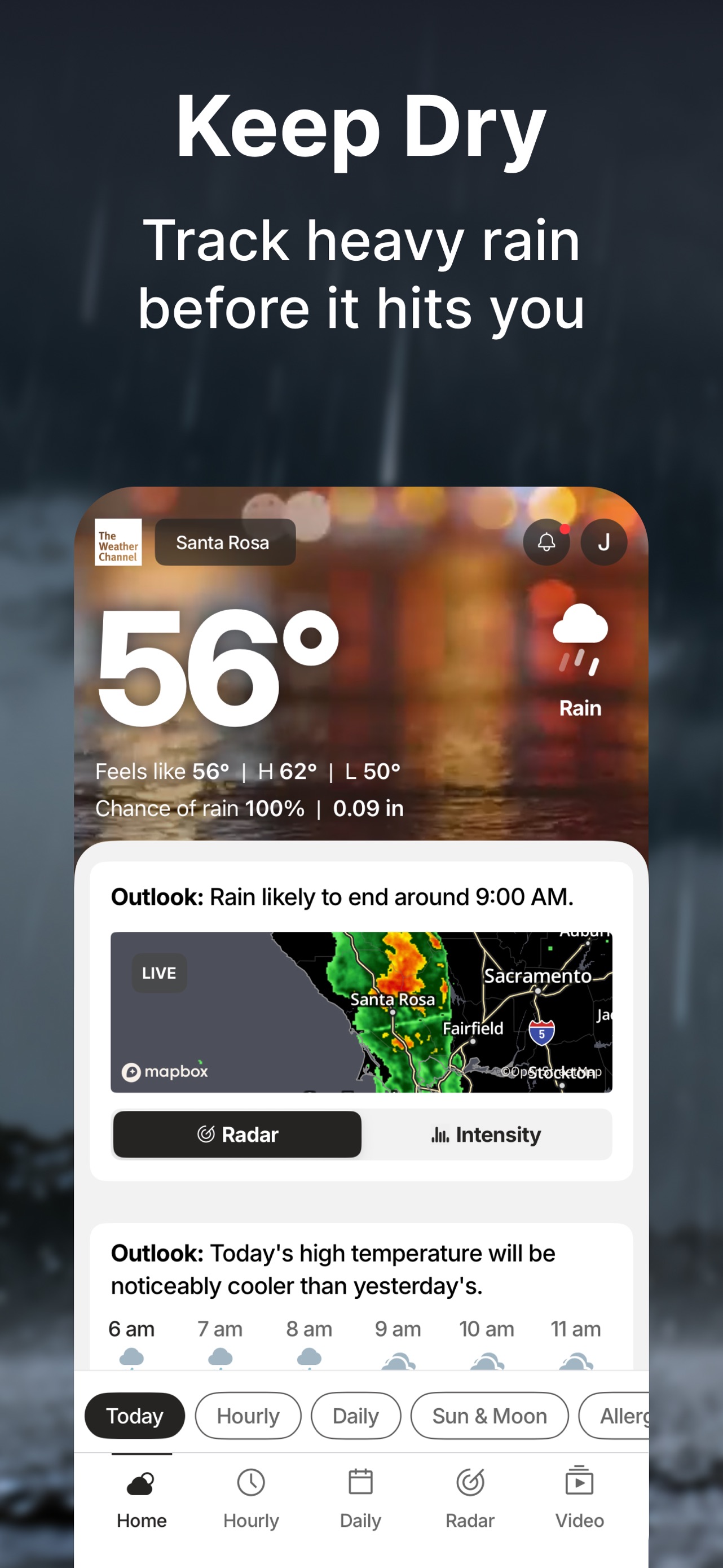
The app provides comprehensive maritime data ranging from real-time tide charts and lunar cycles to detailed weather forecasts and live radar tracking.
iPhone gallery
The complete screenshot set
Select any frame to study its layout, content, and palette.
Observed in the listing
Frame-by-frame listing evidence
Across 5 frames, TIDE most often uses flat ui panel composition and device treatment with gradient backgrounds. 0 frames include visible caption copy.
Frame 1
ui screenshot presentation
- Composition / device
- flat ui panel
- Content
- ui screenshot
- Background
- gradient
- Copy treatment
- none, neutral
Frame 2
ui screenshot presentation
- Composition / device
- flat ui panel
- Content
- ui screenshot
- Background
- photo
- Copy treatment
- none, neutral
Frame 3
ui screenshot presentation
- Composition / device
- flat ui panel
- Content
- ui screenshot
- Background
- gradient
- Copy treatment
- none, neutral
Frame 4
ui screenshot presentation
- Composition / device
- flat ui panel
- Content
- ui screenshot
- Background
- gradient
- Copy treatment
- none, neutral
Frame 5
ui screenshot presentation
- Composition / device
- flat ui panel
- Content
- ui screenshot
- Background
- solid
- Copy treatment
- none, neutral
Explore by detail
Study the system behind the set
Design analysis
What makes this set work
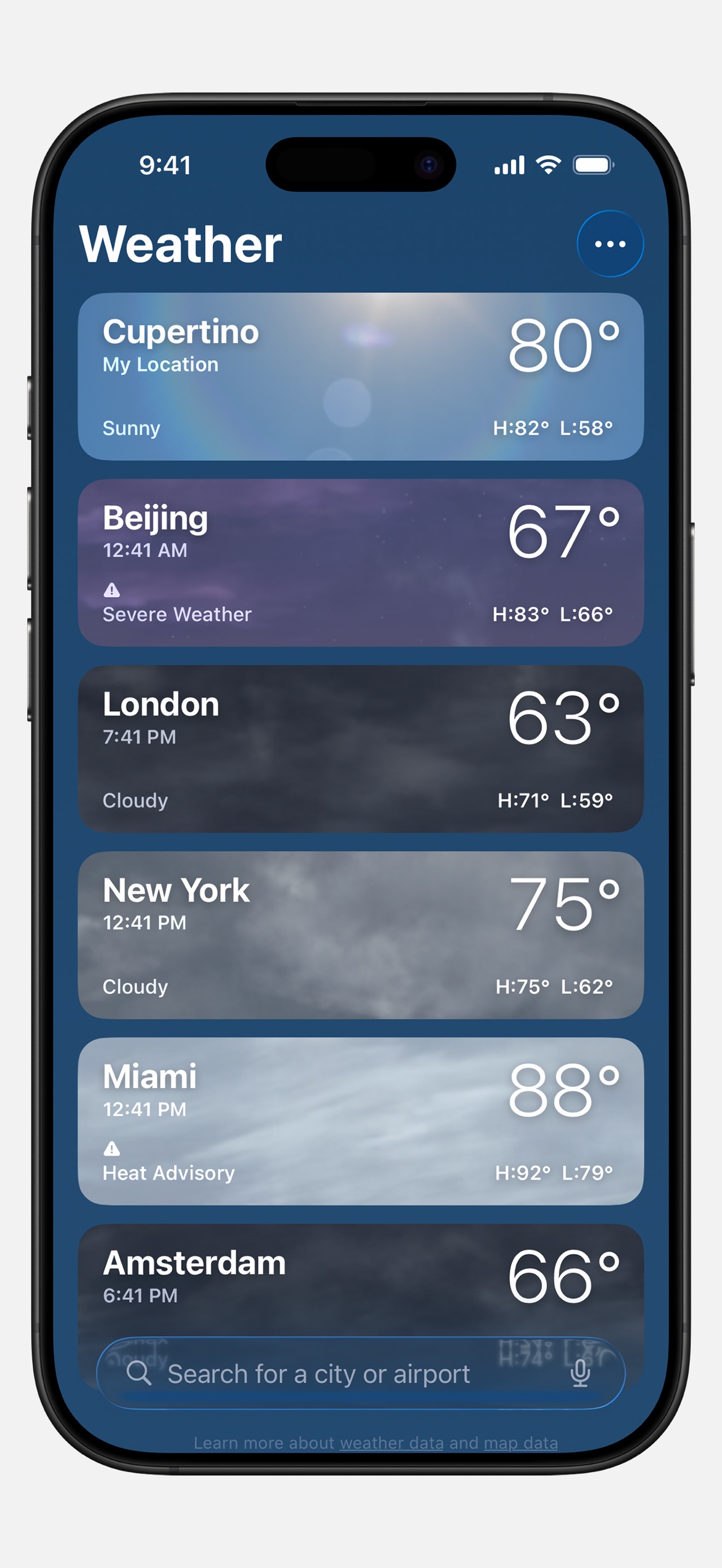
Tide Charts utilizes a "no-frills" utility-first design strategy, presenting raw full-screen UI screenshots without marketing captions or decorative framing. This "what you see is what you get" approach targets a utilitarian audience who prioritize data density and interface familiarity over polished branding. The color system relies on a maritime palette of blues and whites, with occasional functional color cues like red tide alerts or green radar precipitation. A designer can "steal" the focus on high information density; each screen is packed with specific data points without feeling cluttered, using clear tab-based navigation to separate distinct functional modules like tide graphs from radar maps. This strategy builds trust through transparency and technical depth.
Keep exploring