
View on App Store
2.4
54.2K ratingsScreenshot story
The sequence moves from a high-level value proposition to specific utility features like transit and walking, before highlighting immersive exploration and ending on the critical reliability feature of offline access.
iPhone gallery
The complete screenshot set
Select any frame to study its layout, content, and palette.
Observed in the listing
Frame-by-frame listing evidence
Across 6 frames, Apple Maps most often uses floating device composition and device treatment with solid backgrounds. 6 frames include visible caption copy.
Frame 1
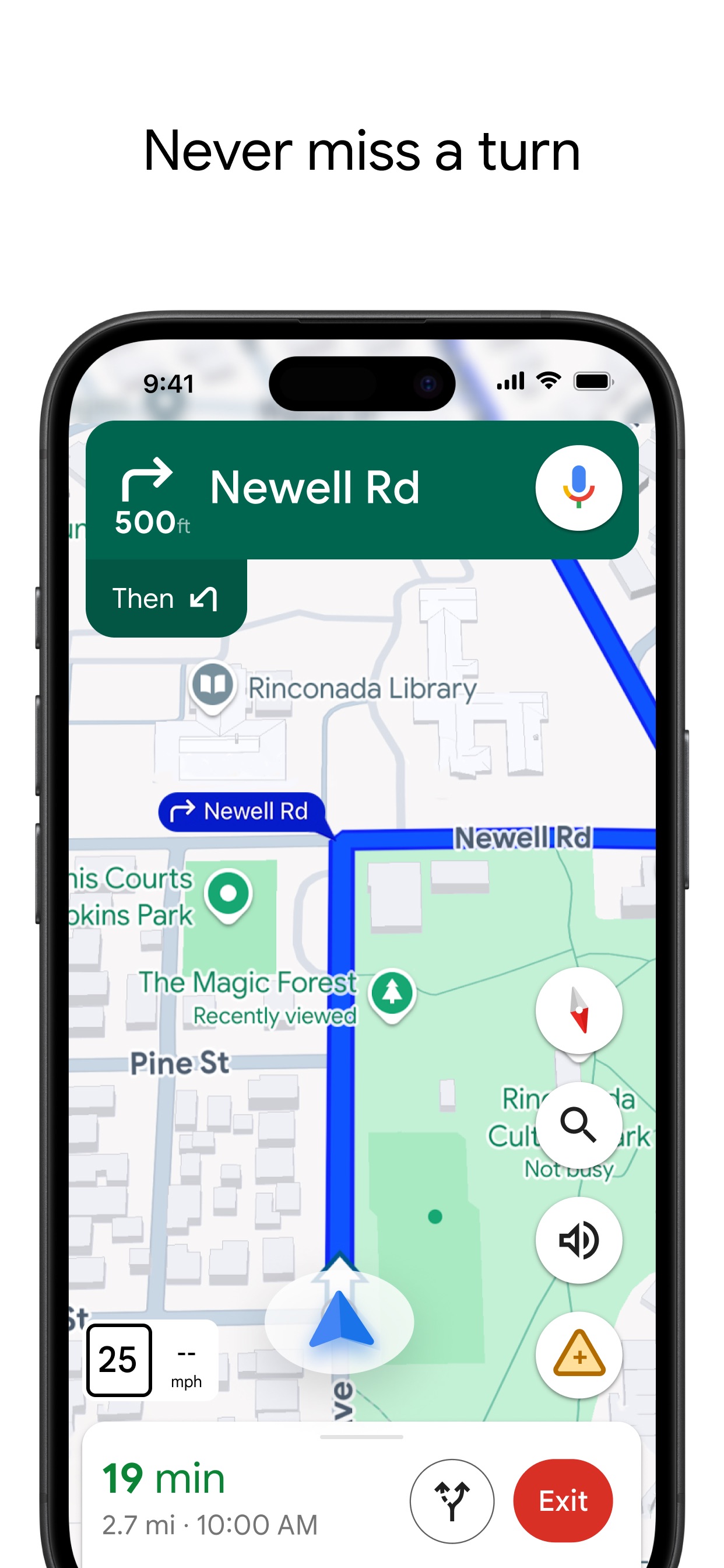
The best way to get around.
- Composition / device
- floating device
- Content
- ui screenshot
- Background
- solid
- Copy treatment
- top, confident, direct
Frame 2
Discover great places with Guides from trusted brands.
- Composition / device
- floating device
- Content
- feature callout
- Background
- solid
- Copy treatment
- top, curated, lifestyle focused
Frame 3
Plan your transit journey with real-time info and departures near you.
- Composition / device
- floating device
- Content
- ui screenshot
- Background
- solid
- Copy treatment
- top, informative, helpful
Frame 4
Follow step-by-step walking directions in augmented reality.
- Composition / device
- floating device
- Content
- ui screenshot
- Background
- solid
- Copy treatment
- top, innovative, technical
Frame 5
Explore cities in 3D with Look Around.
- Composition / device
- floating device
- Content
- lifestyle
- Background
- solid
- Copy treatment
- top, immersive, exploratory
Frame 6
Download maps that you can use while offline.
- Composition / device
- floating device
- Content
- ui screenshot
- Background
- solid
- Copy treatment
- top, utilitarian, practical
Explore by detail
Study the system behind the set
Design analysis
What makes this set work
Apple Maps utilizes a hyper-clean 'floating device' layout that emphasizes native OS integration. By placing the device prominently on a neutral, off-white background, the focus remains entirely on the high-fidelity UI and rich map content. The copywriting strategy uses a rhythmic 'Action Verb + Benefit' structure (Discover, Plan, Follow, Explore) that frames the app as an active companion rather than a static tool. Designers can steal the use of bold, centered headlines paired with secondary light-grey text to establish clear hierarchy. The color palette is strictly aligned with the Human Interface Guidelines (HIG), using system blues and greens to signal trust and officiality. The mix of standard UI lists and immersive 3D/AR vistas provides a balanced view of both the app's utility and its 'wow factor' technology.
Keep exploring
More in Navigation