View on App Store
4.8
7.2M ratingsScreenshot story
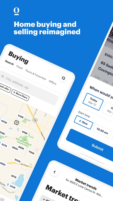
The sequence begins with an emotional lifestyle hook for a seasonal 'Summer Launch', then transitions into a step-by-step feature tour covering onboarding, property search, collaborative saving, and financial pre-approval.
iPhone gallery
The complete screenshot set
Select any frame to study its layout, content, and palette.
Observed in the listing
Frame-by-frame listing evidence
Across 5 frames, Zillow most often uses panoramic composition and device treatment with solid backgrounds. 5 frames include visible caption copy.
Frame 1
SUMMER LAUNCH Plan your move with Zillow Download the app
- Composition / device
- lifestyle photo
- Content
- lifestyle
- Background
- photo
- Copy treatment
- overlay, energetic, promotional
Frame 2
Start with a clear plan
- Composition / device
- panoramic
- Content
- onboarding
- Background
- gradient
- Copy treatment
- top, organized, encouraging
Frame 3
Reach serious buyers sooner
- Composition / device
- panoramic
- Content
- ui screenshot
- Background
- solid
- Copy treatment
- bottom, efficient, professional
Frame 4
Shop & save homes together
- Composition / device
- panoramic
- Content
- ui screenshot
- Background
- solid
- Copy treatment
- top, collaborative, social
Frame 5
See homes that fit your budget
- Composition / device
- floating device
- Content
- ui screenshot
- Background
- solid
- Copy treatment
- top, practical, reassuring
Explore by detail
Study the system behind the set
Design analysis
What makes this set work
Zillow utilizes a sophisticated panoramic layout that physically connects lifestyle photography with mobile UI, creating a seamless narrative flow. The visual anchor is the brand's 'Electric Blue,' which provides a high-contrast backdrop for white, bold sans-serif typography. This color system ensures the marketing message is legible even at thumbnail sizes. A designer can 'steal' their use of floating UI cards that break the container of the device frame, creating a sense of depth and focus on specific features like 'Shared saves' or 'Pre-approval.' The copywriting successfully shifts from aspirational lifestyle benefits to hard utility, guiding the user from the dream of a new home to the reality of the transaction.
Keep exploring