
View on App Store
4.7
36.4K ratingsScreenshot story
The set opens with vibrant, character-driven illustrations to hook users on music discovery and social sharing before transitioning into a comprehensive feature tour. It systematically demonstrates the app's personalization, gaming, and utility features using a consistent, high-contrast dark-mode layout.
iPhone gallery
The complete screenshot set
Select any frame to study its layout, content, and palette.
Observed in the listing
Frame-by-frame listing evidence
Across 9 frames, Deezer most often uses flat ui panel composition and device treatment with solid backgrounds. 8 frames include visible caption copy.
Frame 1
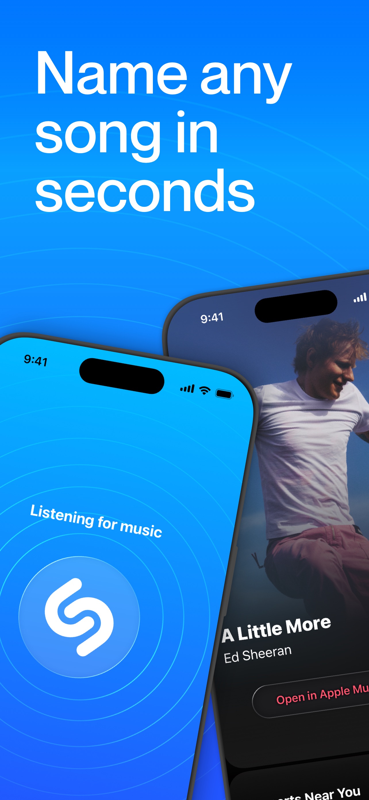
FIND ANY TUNE IN SECONDS
- Composition / device
- collage
- Content
- feature callout
- Background
- solid
- Copy treatment
- top, bold, benefit led
Frame 2
ui screenshot presentation
- Composition / device
- floating device
- Content
- ui screenshot
- Background
- gradient
- Copy treatment
- none, informative, technical
Frame 3
Share your music with everyone
- Composition / device
- collage
- Content
- feature callout
- Background
- solid
- Copy treatment
- top, social, inviting
Frame 4
Recommendations just for you
- Composition / device
- flat ui panel
- Content
- ui screenshot
- Background
- solid
- Copy treatment
- top, direct, personal
Frame 5
Pick a theme and play our music quizzes!
- Composition / device
- flat ui panel
- Content
- ui screenshot
- Background
- solid
- Copy treatment
- top, playful, engaging
Frame 6
Playlists for all vibes
- Composition / device
- flat ui panel
- Content
- ui screenshot
- Background
- solid
- Copy treatment
- top, cool, lifestyle focused
Frame 7
Listen to your music offline
- Composition / device
- flat ui panel
- Content
- ui screenshot
- Background
- solid
- Copy treatment
- top, functional, direct
Frame 8
Instant translated lyrics
- Composition / device
- flat ui panel
- Content
- ui screenshot
- Background
- solid
- Copy treatment
- top, useful, innovative
Frame 9
Collect your favorites
- Composition / device
- flat ui panel
- Content
- ui screenshot
- Background
- solid
- Copy treatment
- top, orderly, personal
Explore by detail
Study the system behind the set
Design analysis
What makes this set work
Deezer’s screenshot strategy is a masterclass in the 'illustration-to-interface' transition. The first three screens leverage maximalist, chunky character illustrations to establish a playful brand identity and highlight social features. This shifts abruptly into a highly structured 'feature tour' from screen four onwards. Each subsequent slide utilizes a consistent template: a bold, top-aligned caption, a centered dark-mode UI panel, and a signature purple wavy footer. This layout choice minimizes cognitive load while showcasing feature density. Designers should note the high-contrast color palette-electric purple against stark white-and the use of dark mode UI to make album art and interface elements pop. The inclusion of trending artists serves as subtle social proof and relevancy signaling.
Keep exploring