
View on App Store
4.7
1.6M ratingsScreenshot story
The story begins with a relatable hook about real-world socializing before transitioning into a modular showcase of organizational, social, and creative tools designed for active communities.
iPhone gallery
The complete screenshot set
Select any frame to study its layout, content, and palette.
Observed in the listing
Frame-by-frame listing evidence
Across 8 frames, GroupMe most often uses floating device composition and device treatment with solid backgrounds. 7 frames include visible caption copy.
Frame 1
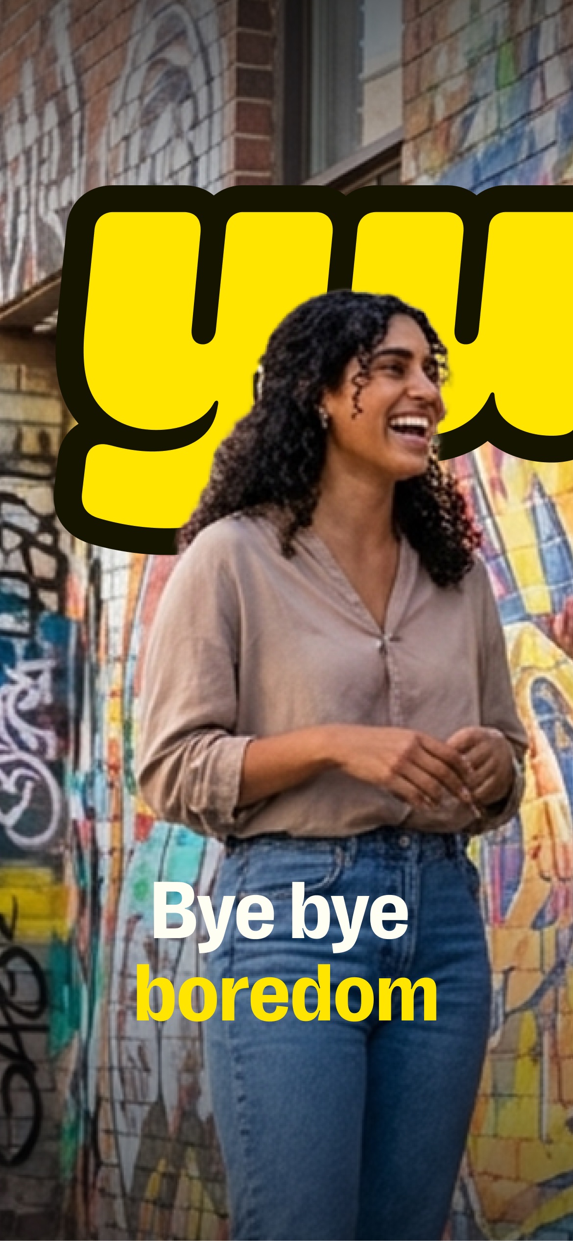
group chats for people who touch grass
- Composition / device
- panoramic
- Content
- lifestyle
- Background
- photo
- Copy treatment
- top, edgy, benefit led
Frame 2
ui screenshot presentation
- Composition / device
- panoramic
- Content
- ui screenshot
- Background
- photo
- Copy treatment
- none, none
Frame 3
organize the chaos
- Composition / device
- floating device
- Content
- ui screenshot
- Background
- solid
- Copy treatment
- top, minimalist, direct
Frame 4
share your vibe
- Composition / device
- floating device
- Content
- ui screenshot
- Background
- solid
- Copy treatment
- top, expressive, youthful
Frame 5
collect rsvps
- Composition / device
- floating device
- Content
- ui screenshot
- Background
- gradient
- Copy treatment
- top, utility led, clear
Frame 6
invite your community
- Composition / device
- floating device
- Content
- social proof
- Background
- solid
- Copy treatment
- top, community focused, informative
Frame 7
remix photos
- Composition / device
- floating device
- Content
- feature callout
- Background
- solid
- Copy treatment
- top, playful, creative
Frame 8
dial the chat
- Composition / device
- floating device
- Content
- ui screenshot
- Background
- gradient
- Copy treatment
- top, action oriented, simple
Explore by detail
Study the system behind the set
Design analysis
What makes this set work
GroupMe successfully pivots from a legacy SMS utility to a Gen-Z lifestyle app through smart copywriting and high-contrast visuals. By leading with the 'touch grass' meme, they immediately align with contemporary cultural values of authenticity and offline interaction. The layout strategy uses a panoramic lifestyle opener to establish vibe, followed by ultra-clean floating devices against deep black backgrounds to highlight 'Discord-like' features such as Topics and AI-powered Remixing. The use of lowercase typography across all captions maintains a casual, conversational brand voice. Designers should steal the 'Topic' visualization (Slide 3) and the use of colorful, semi-transparent gradients to soften a dark-mode UI, making the app feel less like a tool and more like a social hub.
Keep exploring